背景
| 属性名 | 描述 |
|---|---|
background-color | 设置元素的背景颜色。 |
background-image | 设置元素的背景图片。背景图片与背景颜色同时设置时,则图片覆盖颜色。写法如下:background-image: url("图片路径"); |
background-repeat | 设置元素的背景图片平铺效果。如果没有设置图片,则该属性不起作用。取值如下: repeat-x:横向平铺 repeat-y:纵向平铺 repeat:在横向和纵向平铺 no-repeat:不平铺 round:缩放平铺 space:松散平铺 |
background-size | 设置元素的背景图片的尺寸大小。值有2种设置方式: 1个属性值,表示同时设置背景图片的宽度与高度。 2个属性值,表示单独设置背景图片的宽度与高度。 |
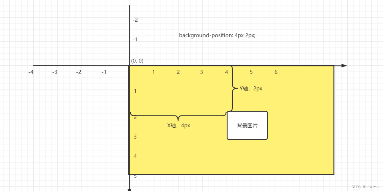
background-position | 设置元素的背景图片的定位效果,以元素左上角为为坐标原点(0,0)进行偏移设置。格式如下:background-position: x轴偏移量 y轴偏移量; |
| background-attachment | 定义元素滚动时背景图片相对于谁固定。取值如下: fixed: 相对于视口固定。 scroll:相对于元素固定,当元素内容滚动时背景图片不会跟着滚动,但会随元素的祖先元素滚动。 local: 相对于元素内容固定,当元素随元素滚动时背景图片也会跟着滚动。 |
background | 上面所有元素背景属性的集体简写方式。书写格式如下:background: 背景颜色 背景图片 平铺方式 x轴偏移 y轴偏移; 顺序可以打乱 |
背景定位(黄色矩形为元素,白色为背景图片)
<!DOCTYPE html>
<html lang="en">
<head>
    <meta charset="UTF-8">
    <title>Title</title>
    <style>
    .page{
        width: 100%;
        max-width: 1600px;
        margin: 0 auto;
        height: 500px;

        /*background-color: red;  !* 背景图片被覆盖背景颜色 *!*/
        /*background-image: url("assets/images/3f7f689039c6c5b5cbfb6a4c4cae5079.jpeg");  !*可以是网络路径,也可以是本地路径*!*/
        /*background-repeat: no-repeat; !* 不平铺 *!*/
        /*background-repeat: repeat-y;  !* 垂直平铺,延Y轴平铺 *!*/
        /*background-repeat: repeat-x;  !* 横向平铺,延X轴平铺 *!*/
        /*background-repeat: repeat;  !* 全部平铺,默认值 *!*/

        /*background-size: 100% 100%;  !* 设置背景图片的大小 宽度 高度 *!*/
        /*background-size: 100%;  !* 如果是单独一个参数时,则表示只设置宽度,高度按比例缩放 *!*/
        /*background-size: auto 100%;  !* 表示单独指定高度,宽度按比例缩放 *!*/

        /*背景图片定位:以元素右上角作为原点(0,0)*/
        /*background-position: 100px 100px;*/


        /*background-attachment: fixed;   !*元素的背景图片,相对于窗口固定,元素滚动时,背景图片不会跟着滚动*!*/
        /*background-attachment: scroll;   !*相对于元素固定,当元素内容滚动时背景图片不会跟着滚动*!*/
        /*background-attachment: local;    !*相对于元素固定,当元素内容滚动时背景图片也会跟着滚动*!*/
        /*overflow: scroll; !* 溢出内容的处理方式:scroll表示当内容超出元素本身的高度与高度时,出现滚动条 *!*/

        background: red url("assets/images/3f7f689039c6c5b5cbfb6a4c4cae5079.jpeg") no-repeat 200px 100px;
    }
    </style>
</head>
<body style="height: 3000px;">
    <div class="page">
        hello world;<br>
        hello world;<br>
        hello world;<br>
        hello world;<br>
        hello world;<br>
        hello world;<br>
        hello world;<br>
        hello world;<br>
        hello world;<br>
        hello world;<br>
        hello world;<br>
        hello world;<br>
        hello world;<br>
        hello world;<br>
        hello world;<br>
        hello world;<br>
        hello world;<br>
        hello world;<br>


    </div>
</body>
</html>
界面效果相关的属性
| 属性 | 描述 |
|---|---|
| ouline | 外边线 |
| cursor | 鼠标光标在网页中外观形状,常用值:pointer |
| resize | 是否允许用户缩放,调节元素尺寸大小 none: 不允许用户调整元素大小。 both: 用户可以调节元素的宽度和高度。 horizontal: 用户可以调节元素的宽度 vertical: 用户可以调节元素的高度 |
<!DOCTYPE html>
<html lang="en">
<head>
    <meta charset="UTF-8"> <!-- 设置文档字符编码为UTF-8 -->
    <title>Title</title> <!-- 设置文档标题 -->
    <style>
    .box{ <!-- 定义一个类选择器,用于设置盒子样式 -->
        width: 200px; <!-- 设置盒子宽度为200像素 -->
        height: 200px; <!-- 设置盒子高度为200像素 -->
        background: red; <!-- 设置盒子背景颜色为红色 -->
        cursor: pointer; /* 爪子 */ <!-- 设置鼠标悬停在盒子上时的鼠标样式为手型 -->
    }
    input[type="text"]{ <!-- 定义一个属性选择器,用于设置文本输入框样式 -->
        /*outline: 1px solid red;*/ <!-- 设置文本输入框的轮廓为1像素红色实线 -->
        outline: none; <!-- 去掉文本输入框的默认轮廓 -->
    }
    textarea[name="desc"]{ <!-- 定义一个属性选择器,用于设置文本域样式 -->
        width: 200px; <!-- 设置文本域宽度为200像素 -->
        height: 80px; <!-- 设置文本域高度为80像素 -->
        resize: none; /* 禁止 */ <!-- 禁止用户调整文本域的大小 -->
    }
    </style>
</head>
<body>
<!--<div class="box"></div>--> <!-- 创建一个盒子元素 -->
<!--<input type="text"><br>--> <!-- 创建一个文本输入框元素 -->
<textarea name="desc" id=""></textarea> <!-- 创建一个文本域元素 -->
</body>
</html>
网页布局
所谓的布局就是依靠css布局让html元素,可以按照UI设计师提供的设计稿进行HTML网页的内容排版并实现页面的布局效果。
布局的学习关键就是:1. 布局方式,2. 盒模型,3. css样式。
css中提供了4种布局方式:分别是流式布局(默认方式),浮动布局,定位布局,弹性布局(伸缩盒)。
布局属性
表格相关
纯粹的表格布局,现在已经不再被大规模应用于网页布局了,而是采用了div+css模拟表格实现了更加灵活的表格,或更加美观的表格效果。但是,在旧的项目中或者是一些基于快速实现的后台工作人员使用的admin站点,还是会存在表格布局的写法,或者在开源的UI框架中也会存在部分的表格布局。所以,现在的表格标签,仅仅是用于展示页面中的一些数据会比较常见。
| 属性 | 描述 |
|---|---|
border-collapse | 合并边框 |
| border-spacing | 设置单元格之间的间距 |
<!DOCTYPE html>
<html lang="en">
<head>
    <meta charset="UTF-8">
    <title>Title</title>
    <style>
    table, tr,th, td{
        margin: 0;
        padding: 0;
    }

    table{
        width: 400px;
        /*border-spacing: 2px;  !* 设置单元格之间的间距 *!*/
        border-collapse: collapse; /* 合并边框 */
    }
    tr th{
        background-color: rgba(255,0,0,0.2);
        border-bottom: 1px solid red;
    }
    tr td {
        text-align: center;
        border-bottom: 1px solid rgba(0, 0, 0, 0.3);
    }
    </style>
</head>
<body>
    <table>
        <tr>
            <th>ID </th>
            <th>Title</th>
            <th>Price</th>
        </tr>
        <tr>
            <td>1</td>
            <td>浪潮之巅</td>
            <td>99.60</td>
        </tr>
        <tr>
            <td>2</td>
            <td>人月神话</td>
            <td>85.50</td>
        </tr>
        <tr>
            <td>3</td>
            <td>代码之髓</td>
            <td>35.50</td>
        </tr>
        <tr>
            <td>4</td>
            <td>编程珠玑</td>
            <td>25.50</td>
        </tr>
    </table>
</body>
</html>
列表相关
| 属性 | 描述 |
|---|---|
list-style | 列表项目符号类型 |
<!DOCTYPE html>
<html lang="en">
<head>
<meta charset="UTF-8">
<title>Title</title>
<style>
a{
color: #333;
text-decoration: none;
}
a:hover {
color: #0c82ff;
}
ul{
padding: 0;
margin: 0;
list-style: none; /* 去除列表项目符号,改用普通图片或者元素背景来实现项目符号。 */
}
.contest {
width: 440px;
margin: 0 auto;
}
.contest li {
height: 36px;
line-height: 36px;
padding-left: 2rem;
background: url("assets/images/sprites-0.png") no-repeat 0 -489px; /* 项目符号 */
}
</style>
</head>
<body>
<div class="contest">
<ul>
<li><a href="">26年世界杯举办城市:美国11座 墨西哥3加拿大2</a></li>
<li><a href="">9大交易签约动态:哈登将执行选项 湖人追比尔搭档詹眉</a></li>
<li><a href="">门将罕见两失误送礼!长春亚泰0-4惨负山东泰山</a></li>
<li><a href="">心态崩了!亚泰门将一场两次低级失误 将球送进自家球门</a></li>
<li><a href="">英超新赛季8月6日开赛 水晶宫vs阿森纳打响揭幕战</a></li>
</ul>
</div>
</body>
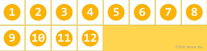
</html>精灵图
所谓的精灵图(sprites)就是为了减少客户端请求服务端的次数而把项目中所有的图片全部绘制来一张图上的优化技术,这张图就是精灵图或者雪碧图。精灵图一般会采用png等支持透明格式的图片

元素显示模式
| 属性 | 描述 |
|---|---|
display | 设置元素的显示模式 inline 设置当前元素为行内元素 block 设置当前元素为块级元素 inline-block 设置当前元素为行内块级元素 none 设置当前元素为隐藏元素 |
<!DOCTYPE html>
<html lang="en">
<head>
    <meta charset="UTF-8">
    <title>Title</title>
</head>
<body>
    行内元素[inline]:<br>
    特点:<br>
    1. 同一个行内元素,可以一行多个,直到当前一行满行就会换行到第二行显示 <br>
    2. 行内元素默认是没有宽度与高度的,是依靠内容来支撑的。<br>
    3. 行内元素是没有完整的边距的,只存在左右边距,没有上下边距。[边距就是元素与元素或元素与内容之间的空隙] <br>
    <a href="" style="margin-top: 40px;">a元素</a>
    <a href="">a元素</a>
    <a href="">a元素</a>
    <span>span元素</span>
    <span>span元素</span>
    <span>span元素</span>
    <b>字体加粗</b>
    <b>字体加粗</b>
    <i>字体倾斜</i>
    <i>字体倾斜</i>

    <hr>
    行内块级元素[inline-block]:<br>
    也叫行级块状元素,特点:<br>
    1. 同一个行内块级元素,可以一行多个,直到当前一行满行就会换行到第二行显示 <br>
    2. 行内块级元素默认是没有宽度与高度的,是依靠内容来支撑,但是可以通过css样式属性设置宽度与高度<br>
    3. 行内块级元素是完整的边距的 <br>
    <style>
    img, input, button{
        width: 100px;
        height: 100px;
        margin-top: 40px; /* 上外边距:40px; */
        margin-left: 40px; /* 上外边距:40px; */
    }
    </style>
    <img src="" alt=""><img src="1.gif" alt=""><img src="1.gif" alt="">
    <input type="text">
    <input type="text">
    <input type="text">
    <button>按钮</button>
    <button>按钮</button>
    <button>按钮</button>

    <hr>
    块级元素[block]:<br>
    特点:<br>
    1. 同一个块级元素,只能一行一个,自带换行<br>
    2. 块级元素默认是没有高度的,是依靠内容来支撑,宽度默认占据父级元素的100%宽度。可以通过css样式属性设置宽度与高度<br>
    3. 块级元素是完整的边距的 <br>
    <style>
    p{
        margin-top: 40px;
        background-color: red;
        width: 200px;
    }
    .box1{
        width: 200px;
        height: 200px;
        background-color: yellow;
    }
    .box2{
        height: 150px;
        background-color: red;
    }
    </style>
    <p>p标签</p>
    <p>p标签</p>
    <div class="box1">
        <div class="box2"></div>
    </div>
    <div>div标签</div>
    <h1 style="margin-bottom: 40px;">h1</h1>
    <h1>h1</h1>

    <hr>
    隐藏元素[none]:<br>
    特点:<br>
    1. 用户不可见,隐藏的内容不会占用网页空间,也就是没有宽高。<br>
    <input type="hidden" name="id" value="1">
    除了上面这个,还有 head,title,mate等元素。<br>
    <hr>
    在后面的css学习中,我们会学习到1个display属性,这个属性可以改变元素的显示模式。<br>
    <style>
    .box3{
        width: 200px;
        height: 200px;
        background-color: red;
        /*display: inline-block;   !* 设置当前元素为行内块级元素 *!*/
        /*display: block;  !* 设置当前元素为块级元素 *!*/
        display: none;  /* 设置当前元素为隐藏元素 */
    }
    .box4{
        width: 100px;
        height: 100px;
        background-color: cornflowerblue;
        display: inline;  /* 设置当前元素为行内元素 */
    }
    </style>
    <a class="box3" href="">a标签</a>
    <a class="box3" href="">a标签</a>
    <div class="box4">div标签</div>
    <div class="box4">div标签</div>
</body>
</html>
流式布局/文档流
HTML网页根据编写的源码中的元素排序在浏览器中从上往下,从左往右逐个呈现。
<!DOCTYPE html>
<html>
<head>
    <meta charset="UTF-8">
    <title></title>
    <style>
    body, h1, p{
        margin: 0;
        padding: 0;
    }
    .article{
        width: 1160px;
        margin: 0 auto;
    }
    .article .title{
        margin-top: 15px;
        color: #333333;
        text-align: center;
        font-size: 22px;
        line-height: 40px;
    }
    .article .created_time{
        font-size: 14px;
        color: #999999;
        line-height: 32px;
        text-align: center;
    }
    .article content{
        font-size: 17px;
        line-height: 24px;
        color: #666;
    }
    .article content p{
        text-indent: 2rem;
    }
    .article content img{
        width: 100%;
        max-width: 100%;
        margin-top: 26px;
    }
    </style>
</head>
<body>
    <!-- HTML5.0以后新增的语义化标签:menu,article, content, section等等
         https://www.bilibili.com/read/cv16747716
     -->
    <article class="article">
        <h1 class="title">在营销角度下,企业网站优化该怎么做</h1>
        <p class="created_time">发布时间:2015-08-30</p>
        <content>
            <p>从事企业网站优化也有一些年头了,从业的前两年,一门心思只想着把网站排名优化到前面,至于网站的构架,内容、以及用户体验等基本不考虑,后来才慢慢懂得了网络营销是怎么一回事。网站排名是重要,但是做网站优化的最终目的确是为企业网站带来营销价值。如果站在这个更高的角度来看网站优化的话,网站优化就不单单只是排名了。企业网站在营销角度下,我们优化过程中一定要注意的问题。</p>
            <img src="assets/images/photo--6.png" alt="">
            <p>第一,分析你的目标群体。网络营销非常关键的一个问题就是网站定位,具体到企业站而言就是我们的目标群体分析,对企业产 品需求的是哪一类群体?群体特征都有哪些?用户年龄段分布情况、身份是工薪阶层还是学生或者是老板?制作一张目标群体分布表。然后根据分布表针对性的分析出他们对于产品的兴趣点所在。那么我们在网站策划、设计以及内容制作的时候,就会有针对性的策略。</p>
        </content>
    </article>
</body>
</html>
弹性布局
任何一个html元素都可以指定为 Flex 盒模型
.box{
    display: flex;  // 行内元素也可以通过 display: inline-flex; 设置为flex盒模型
  }
注意,设为 Flex 布局以后,子元素的float、clear和vertical-align属性将失效。
基本概念
采用 Flex 布局的元素,称为 Flex 容器(flex container),简称"容器"。它的所有子元素自动成为容器成员,称为 Flex 项目(flex item),简称"项目"。

容器默认存在两根轴:水平的主轴(main axis)和垂直的交叉轴(cross axis)。主轴的开始位置(与边框的交叉点)叫做main start,结束位置叫做main end;交叉轴的开始位置叫做cross start,结束位置叫做cross end。
项目默认沿主轴排列。单个项目占据的主轴空间叫做main size,占据的交叉轴空间叫做cross size。
flex容器的属性
flex-direction属性
flex-direction属性决定主轴的方向(即项目的排列方向)
.box {
   flex-direction: row | row-reverse | column | column-reverse;
  }
flex-wrap属性
默认情况下,项目都排在一条线(又称"轴线")上。flex-wrap属性定义,如果一条轴线排不下,如何换行

.box{
   flex-wrap: nowrap | wrap | wrap-reverse;
  }
一共有3个可能的值
nowrap :不换行

wrap:换行,第一行在上行
wrap-reverse:换行,第一行在下方

flex-flow属性
flex-flow属性是flex-direction属性和flex-wrap属性的简写形式,默认值为row nowrap。
.box {
   flex-flow: <flex-direction> || <flex-wrap>;
  }
justify-content属性
justify-content属性定义了项目在主轴(x轴)上的对齐方式
.box {
   justify-content: flex-start | flex-end | center | space-between | space-around;
  }
一共有5个值,具体对齐方式与轴的方向有关。下面假设主轴为从左到右。
align-items属性
align-items属性定义项目在交叉轴上如何对齐
.box {
   align-items: flex-start | flex-end | center | baseline | stretch;
  }
一共有5个可能的值,具体的对齐方式与交叉轴的方向有关,下面假设交叉轴从上到下
align-content属性
align-content属性定义了多根轴线的对齐方式。如果项目只有一根轴线,该属性不起作用
.box {
   align-content: flex-start | flex-end | center | space-between | space-around | stretch;
  }
元素浮动的基本使用
让元素脱离文档流,在浮面上进行排版。
| 属性 | 描述 |
|---|---|
float | left 设置当前元素基于浮面进行靠左浮动 right 设置当前元素基于浮面进行靠右浮动 none 设置当前元素不进行浮动,默认值。 |
clear | left 清除左边浮动带来的影响 right 清除左边浮动带来的影响 both 清除两边浮动带来的影响 |
overflow | 溢出内容处理hidden 溢出隐藏auto 默认不显示滚动条,当内容溢出时,自动显示滚动条 scoll 不管是否内容是否溢出当前元素范围,都固定显示滚动条 |
<!DOCTYPE html>
<html lang="en">
<head>
    <meta charset="UTF-8">
    <title>Title</title>
    <style>
    .box1, .box2, .box3, .box4, .box5, .box6{
        width: 400px;
        height: 200px;
        background: orange;
    }
    .son1, .son2, .son3, .son4, .son5, .son6{
        width: 80px;
        height: 80px;
    }
    .son1{background: gray;}
    .son2{background: blue;}
    .son3{background: red;}
    .son4{background: yellow;}
    .son5{background: purple;}
    .son6{background: pink;}
    </style>
</head>
<body>
    <p>box1:正常情况下,网页中2个表示网页一个板块的块级元素是不能在同一行中显示的。</p>
    <div class="box1">
        <div class="son1">son1</div>
        <div class="son2">son2</div>
    </div>
    <hr>
    <p>box2:元素使用了浮动,就相当于让元素移动到了2楼(此时的元素属于浮动元素,没有使用浮动的元素就是处于1楼的文档流元素)。<br>
        各个浮动元素会自动遵循排列先后循序。<br>
        如果存在一个浮动元素,另一个文档流元素在同一个父级元素下,则可能出现浮动元素覆盖文档流元素的情况。<br>
        被覆盖的文档流元素中如果存在文本内容,则会被溢出</p>
    <style>
    .box2 .son1{float: right;}
    .box2 .son2{float: right;}
    .box2 .son3{float: right;}
    .box2 .son4{float: right;}
    .box2 .son5{float: right;}
    /*.box2 .son6{float: right;}*/
    </style>
    <div class="box2">
        <div class="son1">son1</div>
        <div class="son2">son2</div>
        <div class="son3">son3</div>
        <div class="son4">son4</div>
        <div class="son5">son5</div>
        <div class="son6">son6</div>
    </div>

    <hr>
    <p>box3:如果多个浮动元素,集体往左浮动,那么所有的浮动元素,从左往右排列,直到满行,重新在第二行从左往右排列</p>
    <style>
    .box3 .son1, .box3 .son2, .box3 .son3{float: left;}
    </style>
    <div class="box3">
        <div class="son1">son1</div>
        <div class="son2">son2</div>
        <div class="son3">son3</div>
    </div>

    <hr>
    <p>box4:如果多个浮动元素,集体往右浮动,那么所有的浮动元素,从右往左排列,直到满行,重新在第二行从右往左排列</p>
    <style>
    .box4 .son1, .box4 .son2, .box4 .son3{float: right;}
    </style>
    <div class="box4">
        <div class="son1">son1</div>
        <div class="son2">son2</div>
        <div class="son3">son3</div>
    </div>

    <hr>
    <p>box5:如果多个浮动元素,如果占满了一行,后续的元素会被挤到第二行根据自己的浮动方向从新排列。</p>
    <style>
    .box5 .son1{float: left;}
    .box5 .son2{float: left;}
    .box5 .son3{float: right;}
    .box5 .son4{float: right;}
    .box5 .son5{float: right;}
    .box5 .son6{float: left;}
    </style>
    <div class="box5">
        <div class="son1">son1</div>
        <div class="son2">son2</div>
        <div class="son3">son3</div>
        <div class="son4">son4</div>
        <div class="son5">son5</div>
        <div class="son6">son6</div>
    </div>

   <hr>
    <p>box6:浮动元素排列过程中,如果存在前面的元素是文档流元素,则后续的浮动元素,会在文档流元素的下方排列。</p>
    <style>
    .box6 .son1{float: left;}
    .box6 .son2{float: left;}
    .box6 .son4{float: left;}
    .box6 .son5{float: right;}
    </style>
    <div class="box6">
        <div class="son1">son1</div>
        <div class="son2">son2</div>
        <div class="son3">son3</div>
        <div class="son4">son4</div>
        <div class="son5">son5</div>
    </div>

   <hr>
    <p>box7:如果子元素全部浮动,而父级元素没有设置高度,则会因为子元素浮动而导致父级元素失去高度。<br>
    因为父级元素没有进行浮动,因此还属于文档流元素,因为父级元素在没有高度时需要依靠子元素的内容来支撑高度的。<br>
    而子元素被浮动了,与父级元素不在同一层,会导致父级元素无法依靠子元素来进行内容支撑。<br>
    此时如要让父元素恢复原有的高度有3种解决方案:<br>
        1. 让父元素也浮动起来,这样的话,父子元素都在同一层了,父元素的高度自然恢复<br>
        2. 让父元素在末尾追加一个伪对象元素,让这个伪元素使用clear清除浮动给父元素带来的影响,让伪对象元素处于文档流元素中,父元素的高度也会自然恢复。
    </p>
    <style>
    .box7{width: 400px; background: orange;}
    .box7 .son1{float: left;}
    .box7 .son2{float: left;}
    .box7 .son3{float: left;}
    /* 第一种解决方案 */
    /*.box7{ float:left; }*/

    /*第二种解决方案*/
    /*.son7::after{*/
    /*    display: block;*/
    /*    clear: both;  !* 清除浮动给父父元素带来的影响 *!*/
    /*}*/

    /*第三种解决方案*/
    .box7{
        overflow: hidden;
        /* 溢出文本内容的处理方式,使用这句属性,也可以清除掉浮动元素给当前元素带来的影响。
        overflow本身的作用是处理溢出元素范围的文本的隐藏方式,所以浏览器会调用css重新计算当前元素实际需要占据的空间
        是多少,这样的话,css会重新计算浮动的子元素的实际占据空间,并提供给当前元素,所以当前元素会恢复原有计算高度。
        */
    }
    </style>
    <div class="box7">
        <div class="son1">son1</div>
        <div class="son2">son2</div>
        <div class="son3">son3</div>
    </div>
    <div style="height:400px;width:600px;">结束的DIV</div>
</body>
</html>
元素的文本内容溢出处理
<!DOCTYPE html>
<html lang="en">
<head>
    <meta charset="UTF-8">
    <title>Title</title>
    <style>
    .box{
        width: 100px;
        height: 100px;
        background: red;
        /*overflow: hidden;*/
        /*overflow: scroll;*/
        overflow: auto;
    }
    </style>
</head>
<body>
    <div class="box">
        hello world<br>
        hello world<br>
        hello world<br>
        hello world<br>
        hello world<br>
        hello world<br>
        hello world<br>
    </div>
</body>
</html>
浮动布局效果--图文排版效果
<!DOCTYPE html>
<html lang="en">
<head>
    <meta charset="UTF-8">
    <title>Title</title>
    <style>
    article{
        width: 400px;
    }
    article .img1{
        width: 200px;
        float: left;
        margin-right: 10px;
    }
    </style>
</head>
<body>
    <article>
        <p><img class="img1" src="./assets/images/3f7f689039c6c5b5cbfb6a4c4cae5079.jpeg" alt="">从事企业网站优化也有一些年头了,从业的前两年,一门心思只想着把网站排名优化到前面,至于网站的构架,内容、以及用户体验等基本不考虑,后来才慢慢懂得了网络营销是怎么一回事。网站排名是重要,但是做网站优化的最终目的确是为企业网站带来营销价值。如果站在这个更高的角度来看网站优化的话,网站优化就不单单只是排名了。企业网站在营销角度下,我们优化过程中一定要注意的问题。</p>
    </article>
</body>
</html>
浮动布局效果-板块并排效果
<!DOCTYPE html>
<html lang="en">
<head>
    <meta charset="UTF-8">
    <title>Title</title>
    <style>
    body, ul, li, a, menu{
        margin: 0;
        padding: 0;
    }
    menu, ul{list-style: none}
    a{
        text-decoration: none;
    }
    header{
        height: 40px;
        background: #333;
    }
    .header-top{
        width: 1226px;
        margin: 0 auto;
    }
    .header-top::after{
        content: "";
        display: block;
        clear: both;
    }
    .header-top menu{
        float: left;
    }
    .sectionbar{
        float: right;
    }
    .header-top menu li {
        float: left;
    }
    .header-top li a{
        color: #b0b0b0;
        line-height: 40px;
        display: block;
        font-size: 12px;
    }
    .header-top li a:hover{
        color: #fff;
    }
    .header-top .sep{
        margin: 0 8px;
        color: #424242;
        line-height: 40px;
        font-size: 12px;
    }
    .sectionbar li{
        float: left;
    }
    .sectionbar a{
        padding: 0 5px;
        text-align: center;
    }
    .sectionbar .sep{
        margin: 0;
    }
    .sectionbar .cart{
        width: 120px;
    }
    .download-app{
        position: relative;
    }
    .download-app .img-box{
        position: absolute;
        display: none;
    }
    .download-app:hover .img-box{
        display: block;
    }
    </style>
</head>
<body>
    <header>
        <div class="header-top">
            <menu>
                <li><a href="">小米商城</a></li>
                <li class="sep">|</li>
                <li><a href="">MIUI</a></li>
                <li class="sep">|</li>
                <li><a href="">IoT</a></li>
                <li class="sep">|</li>
                <li><a href="">云服务</a></li>
                <li class="sep">|</li>
                <li><a href="">天星数科</a></li>
                <li class="sep">|</li>
                <li><a href="">有品</a></li>
                <li class="sep">|</li>
                <li><a href="">小爱开放平台</a></li>
                <li class="sep">|</li>
                <li><a href="">企业团购</a></li>
                <li class="sep">|</li>
                <li><a href="">资质证照</a></li>
                <li class="sep">|</li>
                <li><a href="">协议规则</a></li>
                <li class="sep">|</li>
                <li class="download-app">
                    <a href="">下载app</a>
                    <div class="img-box"><img src="//i1.mifile.cn/f/i/17/appdownload/download.png?1" alt="小米商城" width="90" height="90"></div>
                </li>
                <li class="sep">|</li>
                <li><a href="">Select Location</a></li>
            </menu>
            <ul class="sectionbar">
                <li><a href="">登录</a></li>
                <li class="sep">|</li>
                <li><a href="">注册</a></li>
                <li class="sep">|</li>
                <li><a href="">消息通知</a></li>
                <li class="sep">|</li>
                <li class="cart"><a href="">购物车</a></li>
            </ul>
        </div>
    </header>
</body>
</html>
元素定位相关
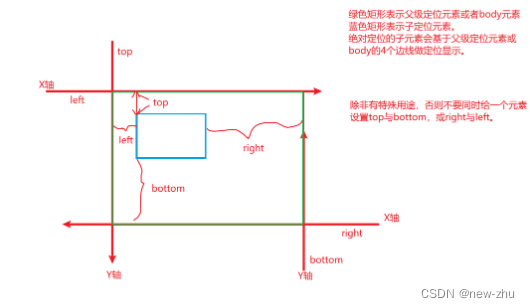
元素定位与元素的背景定位类似,都是通过平面直角坐标系来设置元素的x轴与y轴位置。但是不一样的是,背景仅相对于当前元素做定位,而元素可以相对于其本身原有位置做相对对应,也可以相对于父级元素或body元素做绝对定位,或可以相对于当前窗口做固定定位。
| 属性 | 描述 |
|---|---|
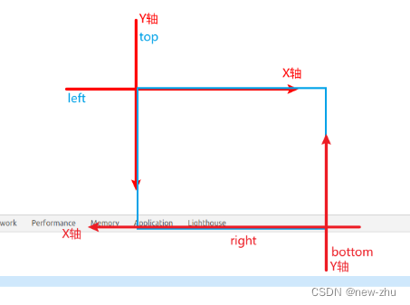
position | 设置元素指定类型的定义元素 static 默认值,不进行定位处理 relative 相对定位,设置当前元素基于当前元素自身所在位置的4个边线进行定位处理absolute 绝对定位,设置当前元素基于父级定位元素进行定位处理注意:如果当前元素的父元素没有设置定位,则往外需要更外层的父级定位元素进行定位,最终直到body元素,就参考body进行定位了 fixed 固定定位,设置当前元素基于浏览器窗口的4个边线进行定位处理默认情况下,只要元素设置了定位(绝对和固定),都会脱离文档流,被浏览器排版到浮面上,其中相对定位因为需要基于自身原来位置进行定位,所以相对定位的元素原有的占位空间不会被回收,其他的类型的定位都会被回收位置。 |
top | 设置元素当前距离参考目标的上边距离 |
bottom | 设置元素当前距离参考目标的下边距离 |
left | 设置元素当前距离参考目标的左边距离 |
right | 设置元素当前距离参考目标的右边距离 |
z-index | 设置定位元素的深度(调整元素的层叠效果),相当于在原有的平面直角坐标系转换成立体坐标系中的Z轴。z-index值越大,层级越高,离用户越近。 |
相对定位
<!DOCTYPE html>
<html lang="en">
<head>
    <meta charset="UTF-8">
    <title>Title</title>
    <style>
    div{
        width: 150px;
        height: 150px;
        background: red;
    }
    .box2{
        background: yellow;
    }
    .box1{
        position: relative;
        left: 50px;
    }
    </style>
</head>
<body>
    <div class="box1"></div>
    <div class="box2"></div>
</body>
</html>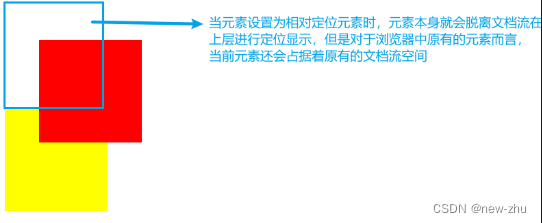
绝对定位
<!DOCTYPE html>
<html lang="en">
<head>
    <meta charset="UTF-8">
    <title>Title</title>
    <style>
    div{
        width: 150px;
        height: 150px;
        background: red;
    }
    .parent{
        width: 400px;
        height: 300px;
    }
    .box1{
        width: 120px;
        height: 120px;
        background: orange;
    }
    .box2{
        background: blue;
    }
    .parent0{
        position: relative; /* 父级元素设置为相对定位,但是不设置坐标 */
        /*overflow: hidden;  !* 子元素虽然作为了绝对定位元素,但是从HTML的标签结构上(DOM树)上,还是属于父级元素的内容,因此超出部分会被隐藏。 *!*/
    }
    .parent0 .box1{
        position: absolute; /* 子元素设置为绝对定位,此时元素就会脱离文档流,不再占用原来的文档流空间 */
        right: -20px;
        bottom: -20px;
    }
    .parent1 .box1{
        background: orange;
        position: absolute;
        bottom: 0;
        left: 0;
    }
    </style>
</head>
<body>
<!--    <h3>当子元素设置为绝对定位,而父元素设置为相对定位时,子元素相对于父元素的4个边线做定位。</h3>-->
<!--    <div class="parent parent0">-->
<!--        <div class="box1"></div>-->
<!--        <div class="box2"></div>-->
<!--    </div>-->

<!--    <h3>当子元素设置为绝对定位,而父元素没有设置定位时,会继续照到设置了定位元素的祖辈元素,如果所有的祖辈元素都没有设置为定位,则当前子元素相对于body元素的4个边线做定位</h3>-->
<!--    <div class="parent parent1" style="position: relative">-->
<!--        <div style="width: 200px;height: 200px;background: greenyellow;">-->
<!--            <div class="box1"></div>-->
<!--            <div class="box2"></div>-->
<!--        </div>-->
<!--    </div>-->

<!--    <h3>父子皆为绝对定位元素时,子元素相对于父元素做定位,而父元素则相对于它的父级定位元素做定位,如果找不到,则父元素相对于body做定位。</h3>-->
<!--    <div class="parent parent2">-->
<!--        <div style="width: 300px;height: 300px;background: greenyellow; position: absolute; bottom: 0; right: 0;">-->
<!--            <div class="box1" style="position: absolute; top: 20px; right: 20px;"></div>-->
<!--            <div class="box2"></div>-->
<!--        </div>-->
<!--    </div>-->

    <h3>子元素相对于父元素做绝对定位,并实现居中效果。</h3>
    <div style="width: 400px;height: 400px; position:relative;">
            <div style="width: 100px;height: 100px; background: orange; position: absolute; left: 0; right: 0; margin: auto">采用定位+边距,左右居中</div>
            <div style="width: 100px;height: 100px; background: yellow; position: absolute; top: 0; bottom: 0; margin: auto">采用定位+边距,上下居中</div>
            <div style="width: 100px;height: 100px; background: yellow; position: absolute; top: 0; right: 0; bottom: 0; left: 0; margin: auto;">绝对居中</div>
    </div>
</body>
</html>
固定定位
<!DOCTYPE html>
<html lang="en">
<head>
    <meta charset="UTF-8">
    <title>Title</title>
    <style>
    div{
        width: 150px;
        height: 150px;
        background: red;
    }
    .parent{
        width: 400px;
        height: 300px;
    }
    .box1{
        width: 120px;
        height: 120px;
        background: orange;
    }
    .parent .box1{
        position: fixed; /* 设置当前元素相对于窗口进行定位显示,不会因为滚动条而滚动 */
        right: 0;
    }
    </style>
</head>
<body style="height: 10000px;">
    <div class="parent">
        <div class="box1"></div>
    </div>
</body>
</html>
针对几种定位属性的使用,只有绝对定位时才会考虑父级元素是否设置为定位。同时,相对定位经常与绝对定位一起使用,而固定定位则单独用于固定头部,固定弹窗,固定右侧楼层,客服信息等等场景中


