余弦相似度是一种用来确定两个向量之间相似性的度量。它在数据科学、信息检索和自然语言处理(NLP)等多个领域被广泛使用,用于度量在多维空间中两个向量之间角度的余弦。这个指标捕捉的是方向上的相似性而非大小,使其非常适合比较长度不同或需要归一化的文档或向量。
定义
余弦相似度使用两个向量的点积及各自向量的大小来计算。余弦相似度的公式是:

其中:
- A 和 B 是您正在计算相似度的两个向量。
- A⋅B 是向量 A 和 B 的点积。
- ∥A∥ 和 ∥B∥ 分别是向量 A 和 B 的欧几里得范数(或大小)。
属性
-
范围:余弦相似度的值范围从 -1 到 1。
- 1 表示两个向量在方向上完全相同。
- 0 表示正交(无相似性)。
- -1 表示两个向量方向完全相反。
-
规模不变性:余弦相似度对乘以常数(规模不变)是不变的。这在比较不同规模的出现频率时特别有用。
简单例子:
from sklearn.metrics.pairwise import cosine_similarity
import numpy as np

# 定义两个向量
vector_a = np.array([[1, 2, 3]])
vector_b = np.array([[4, 5, 6]])

# 计算余弦相似度
similarity = cosine_similarity(vector_a, vector_b)
print("余弦相似度:", similarity[0][0])
我们下面从视觉化的角度,感觉Cosin Simiarity。
首先,我们定义三个向量,并且将它们显示在二维坐标系中。
import numpy as np
import matplotlib
import matplotlib.pyplot as plt

A = [1, 4]
B = [3, 3]
C = [2, 3]

#colors数组为每个向量定义颜色,以便视觉区分。
colors = ['r', 'g', 'b']

#V是从向量A、B和C创建的NumPy数组。
V = np.array([A, B, C])

#向量的起点设置为一个2x3的全零数组。这允许所有向量都从点(0, 0)开始。
origin = np.array([[0, 0, 0],[0, 0, 0]]) # origin point

plt.figure(figsize=(9, 9))

#使用plt.quiver函数绘制向量。参数确保向量从x和y方向的原点绘制。scale_units='xy'和scale=1确保
#向量在x和y方向上按1:1的比例绘制。
plt.quiver(*origin, V[:,0], V[:,1], color=colors, angles='xy', scale_units='xy', scale=1)

for letter, x, y, color in zip('ABC', V[:, 0], V[:, 1], colors):
    plt.text(x / 2., y / 2., letter, fontdict={'size': 20, 'color': color, 'weight': 'bold'}, verticalalignment='top')

plt.xlim(0, 5)
plt.ylim(0, 5)
plt.grid()
plt.show()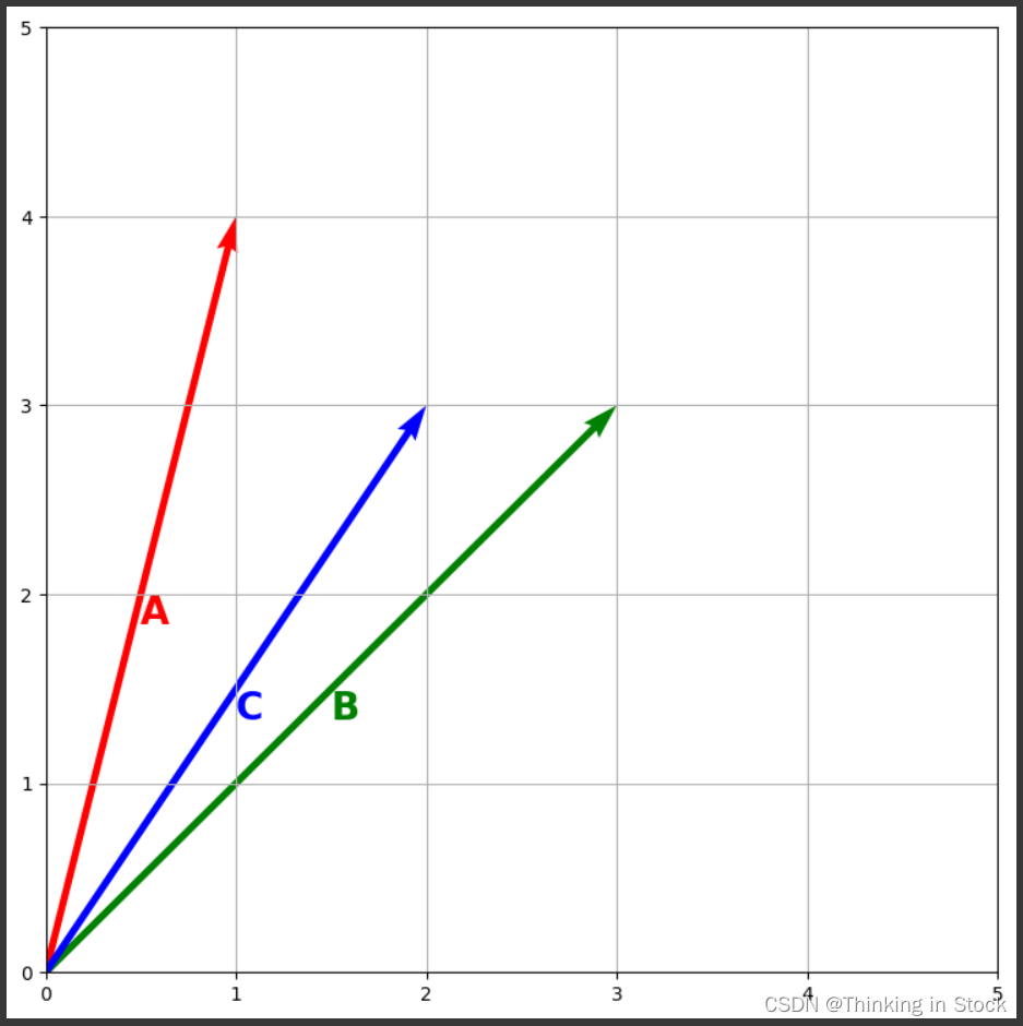
那么问题来了,在向量A和向量C中,哪个与向量B最相似?
为了回答这个问题,我们需要一个衡量相似性的框架。我们可以使用向量之间的夹角作为相似性的衡量标准。它们的角度表明了它们指向类似方向的事实,并且与它们的相对长度无关。
我们倾向于向量指向的方向。角度是两个方向之间差异的衡量标准 我们可以使用这个角度的余弦值:
- 0.0 表示这是一个90度角(垂直):最不相似
- 1.0 表示这是一个平角(平行):最相似
我们通过热力图展示相似度:
from sklearn.metrics.pairwise import cosine_similarity

sims = cosine_similarity([A, B, C])
# from https://matplotlib.org/3.1.1/gallery/images_contours_and_fields/image_annotated_heatmap.html
from mpl_toolkits.axes_grid1 import make_axes_locatable
def heatmap(data, row_labels, col_labels, ax=None,
cbar_kw={}, cbarlabel="", **kwargs):
"""
Create a heatmap from a numpy array and two lists of labels.
Parameters
----------
data
A 2D numpy array of shape (N, M).
row_labels
A list or array of length N with the labels for the rows.
col_labels
A list or array of length M with the labels for the columns.
ax
A `matplotlib.axes.Axes` instance to which the heatmap is plotted. If
not provided, use current axes or create a new one. Optional.
cbar_kw
A dictionary with arguments to `matplotlib.Figure.colorbar`. Optional.
cbarlabel
The label for the colorbar. Optional.
**kwargs
All other arguments are forwarded to `imshow`.
"""
if not ax:
ax = plt.gca()
# Plot the heatmap
im = ax.imshow(data, **kwargs)
# Create colorbar
# We want to show all ticks...
ax.set_xticks(np.arange(data.shape[1]))
ax.set_yticks(np.arange(data.shape[0]))
# ... and label them with the respective list entries.
ax.set_xticklabels(col_labels, fontdict={'size': 20, 'weight': 'bold'})
ax.set_yticklabels(row_labels, fontdict={'size': 20, 'weight': 'bold'})
# Let the horizontal axes labeling appear on top.
ax.tick_params(top=True, bottom=False,
labeltop=True, labelbottom=False)
ax.set_xticks(np.arange(data.shape[1]+1)-.5, minor=True)
ax.set_yticks(np.arange(data.shape[0]+1)-.5, minor=True)
ax.grid(which="minor", linestyle='-', linewidth=1)
ax.tick_params(which="minor", bottom=False, left=False)
return im
def annotate_heatmap(im, data=None, valfmt="{x:.2f}",
textcolors=["black", "white"],
threshold=None, **textkw):
"""
A function to annotate a heatmap.
Parameters
----------
im
The AxesImage to be labeled.
data
Data used to annotate. If None, the image's data is used. Optional.
valfmt
The format of the annotations inside the heatmap. This should either
use the string format method, e.g. "$ {x:.2f}", or be a
`matplotlib.ticker.Formatter`. Optional.
textcolors
A list or array of two color specifications. The first is used for
values below a threshold, the second for those above. Optional.
threshold
Value in data units according to which the colors from textcolors are
applied. If None (the default) uses the middle of the colormap as
separation. Optional.
**kwargs
All other arguments are forwarded to each call to `text` used to create
the text labels.
"""
if not isinstance(data, (list, np.ndarray)):
data = im.get_array()
# Normalize the threshold to the images color range.
if threshold is not None:
threshold = im.norm(threshold)
else:
threshold = im.norm(data.max())/2.
# Set default alignment to center, but allow it to be
# overwritten by textkw.
kw = dict(horizontalalignment="center",
verticalalignment="center")
kw.update(textkw)
# Get the formatter in case a string is supplied
if isinstance(valfmt, str):
valfmt = matplotlib.ticker.StrMethodFormatter(valfmt)
# Loop over the data and create a `Text` for each "pixel".
# Change the text's color depending on the data.
texts = []
for i in range(data.shape[0]):
for j in range(data.shape[1]):
kw.update(color=textcolors[int(im.norm(data[i, j]) > threshold)])
text = im.axes.text(j, i, valfmt(data[i, j], None), **kw)
texts.append(text)
return texts函数:heatmap
此函数从一个2D numpy数组和两个行和列标签列表创建热图。
参数:
data:形状为(N, M)的2D numpy数组,其中N是行数,M是列数。row_labels:长度为N的行标签列表或数组。col_labels:长度为M的列标签列表或数组。ax:绘制热图的matplotlib.axes.Axes实例。如果未提供,则函数将使用当前轴或创建新的轴。cbar_kw:字典,包含matplotlib.Figure.colorbar的参数。它是可选的。cbarlabel:色标的标签。它是可选的。**kwargs:额外的参数被转发给imshow,用于将数据显示为图像。
函数内的主要操作:
- 检查是否传递了Axes实例;如果没有,则检索当前Axes。
- 使用
ax.imshow(data, **kwargs)绘制热图。 - 调整刻度标记和标签以清晰显示。
- 可选地创建色标并设置其标签。
- 格式化次要刻度以在热图的单元格之间创建更好的视觉分隔线。
函数:annotate_heatmap
此函数向热图添加注释,提供数值或热图单元格内的其他文本。
参数:
im:要标记的AxesImage。data:用于注释的数据。如果为None,则使用AxesImage的数据。valfmt:热图内部注释的格式。可以是字符串格式方法或matplotlib.ticker.Formatter。textcolors:两种颜色规格的列表或数组,第一种颜色用于低于阈值的值,第二种用于高于阈值的值。threshold:数据单位中的值,根据此阈值确定如何应用文本颜色。**textkw:额外的关键字参数被转发到创建文本标签的text调用。
函数内的主要操作:
- 根据图像的颜色归一化将阈值归一化。
- 遍历数据数组,并为热图中的每个单元格创建一个使用指定格式的文本标签。
- 根据数据值是否超过阈值选择文本颜色。
fig, ax = plt.subplots(figsize=(9, 9))

im = heatmap(sims, list('ABC'), list('ABC'), ax=ax,
                   cmap="Greens", cbarlabel="Cosine Similarity", vmin=0.0, vmax=1.0)
texts = annotate_heatmap(im, valfmt="{x:.2f}")

divider = make_axes_locatable(ax)
cax = divider.append_axes("right", size="5%", pad=0.2)
fig.colorbar(im, cax=cax)

fig.tight_layout()
plt.show()
绘制结果为:

这是一个对称矩阵,对角线上的相似度值始终为1,因为一个向量与自身的相似度一定为1。
通过比较B和C的相似度为0.98,而A和C的相似度为0.94,C与B更加接近。


