CSS 实现无限波浪边框卡片
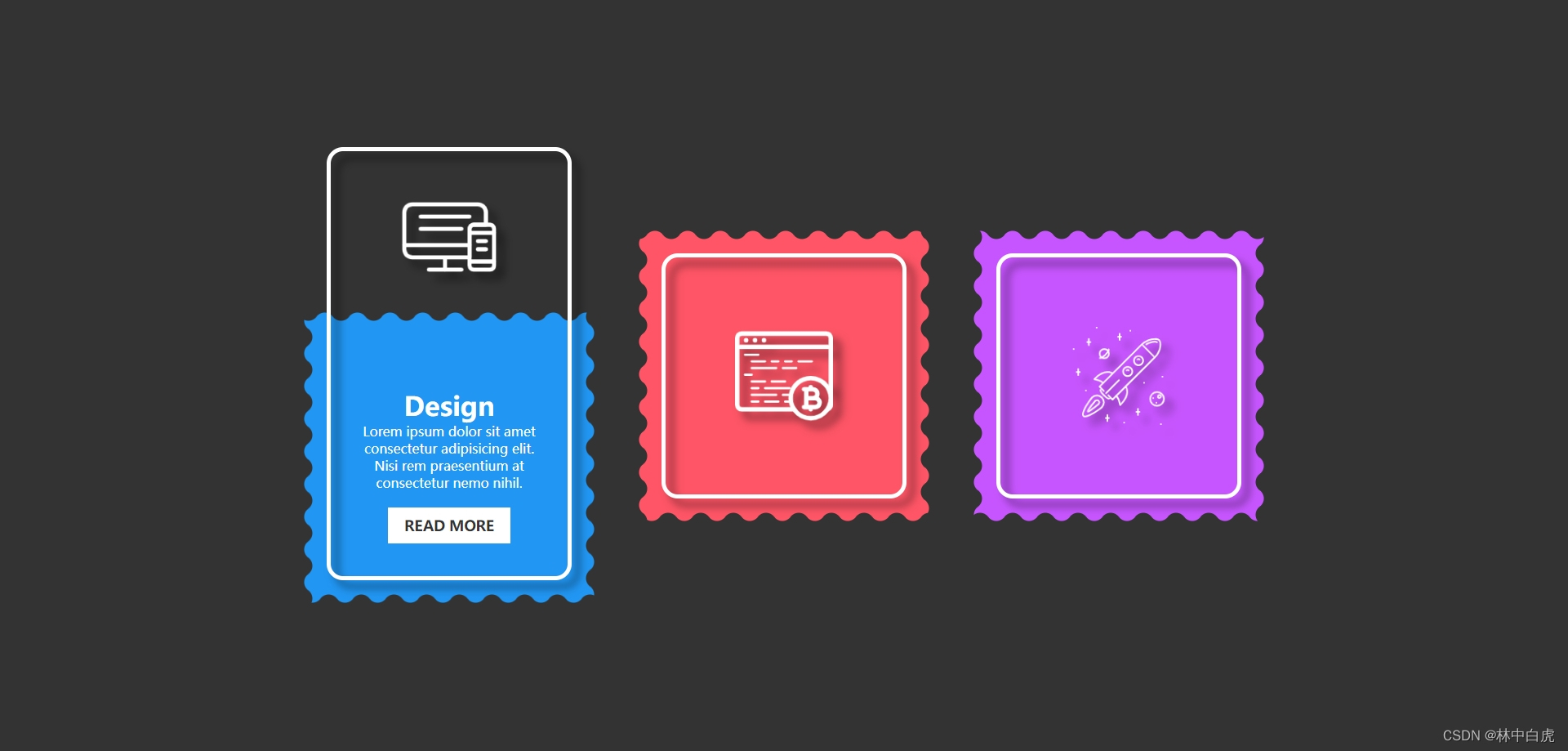
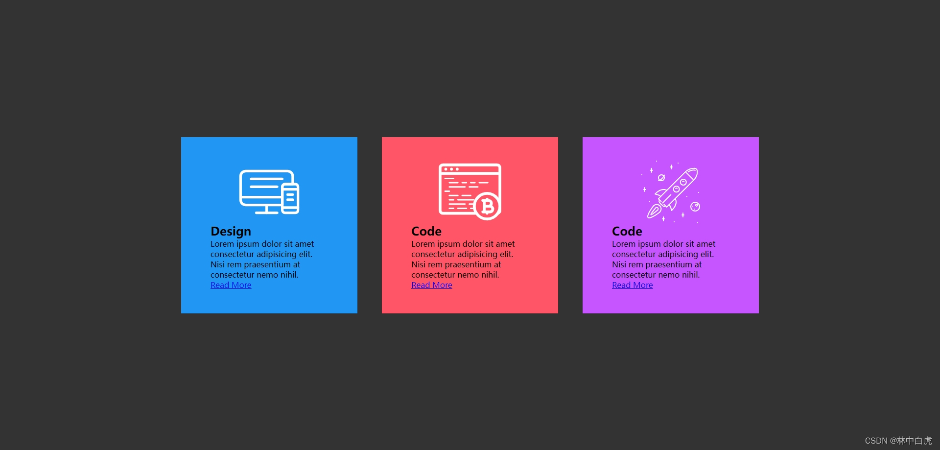
效果展示
-
鼠标悬停效果,底部色块的边框是无限滚动的波浪
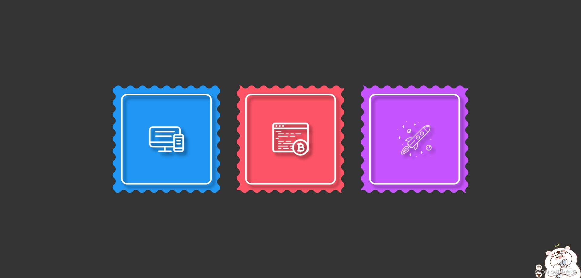
-
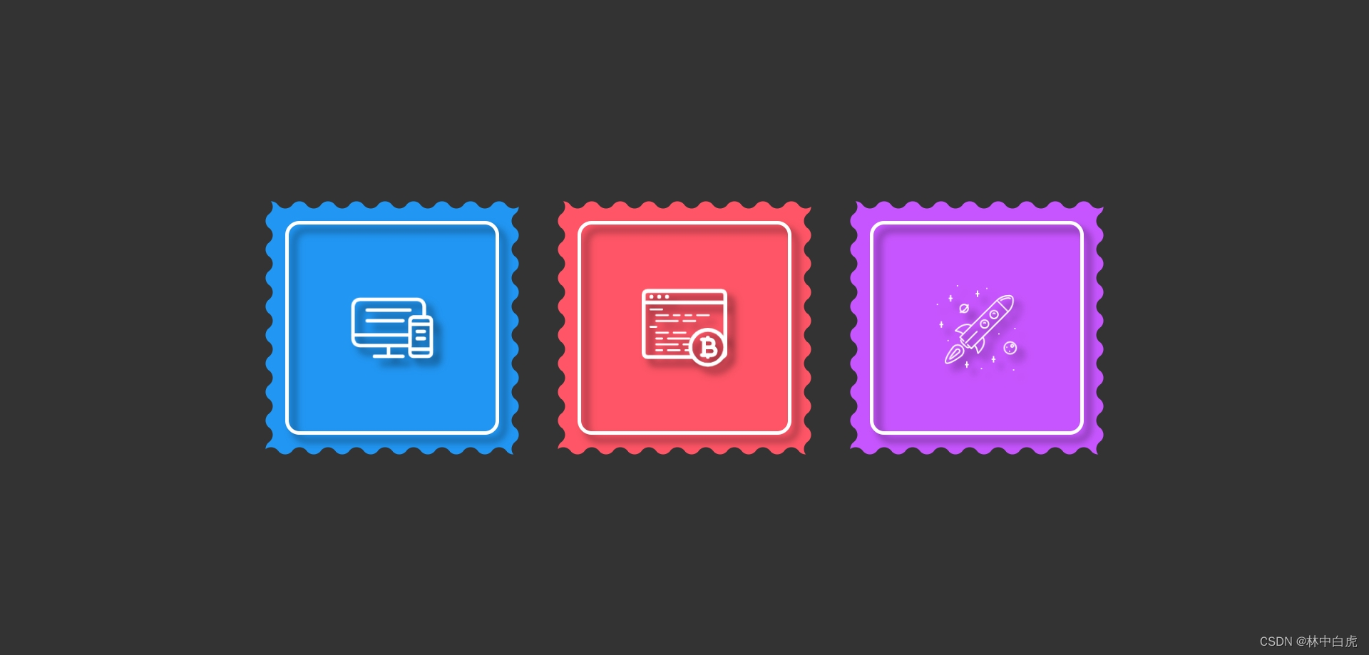
鼠标没有悬停效果
CSS 知识点
- CSS 基础知识回顾
- 使用 radial-gradient 实现波浪边框
- 使用 anumate 属性实现波浪边框动画和控制动画运动
波浪实现原理
波浪边框的实现思路其实就是边框容器(此实例中的边框容器是class="box"的元素)中声明一个元素来作为波浪边框的实现容器(此实例中的波浪容器为span元素),有了波浪边框容器后我们可以使用伪元素形成不同层次并结合radial-gradient实现不同的波浪形状,最后修改对应伪元素的颜色,这样就可以形成波浪,具体的层次关系如下:
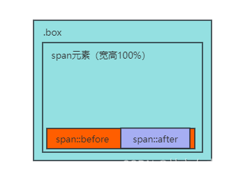
本案例的层次关系如下:
整体页面布局实现
<div class="container">
  <div class="box" style="--clr: #2196f3">
    <!-- 波浪边框(四个span表示四个边框) -->
    <span style="--i:0"></span>
    <span style="--i:1"></span>
    <span style="--i:2"></span>
    <span style="--i:3"></span>
    <img src="./b1.png" />
    <div class="content">
      <h2>Design</h2>
      <p>
        Lorem ipsum dolor sit amet consectetur adipisicing elit. Nisi rem
        praesentium at consectetur nemo nihil.
      </p>
      <a href="#">Read More</a>
    </div>
  </div>
</div>
编写卡片容器样式
.container .box {
  position: relative;
  top: 0;
  width: 360px;
  height: 360px;
  display: flex;
  justify-content: center;
  align-items: center;
  flex-direction: column;
  background: var(--clr);
  transition: 0.5s;
  padding: 60px;
}
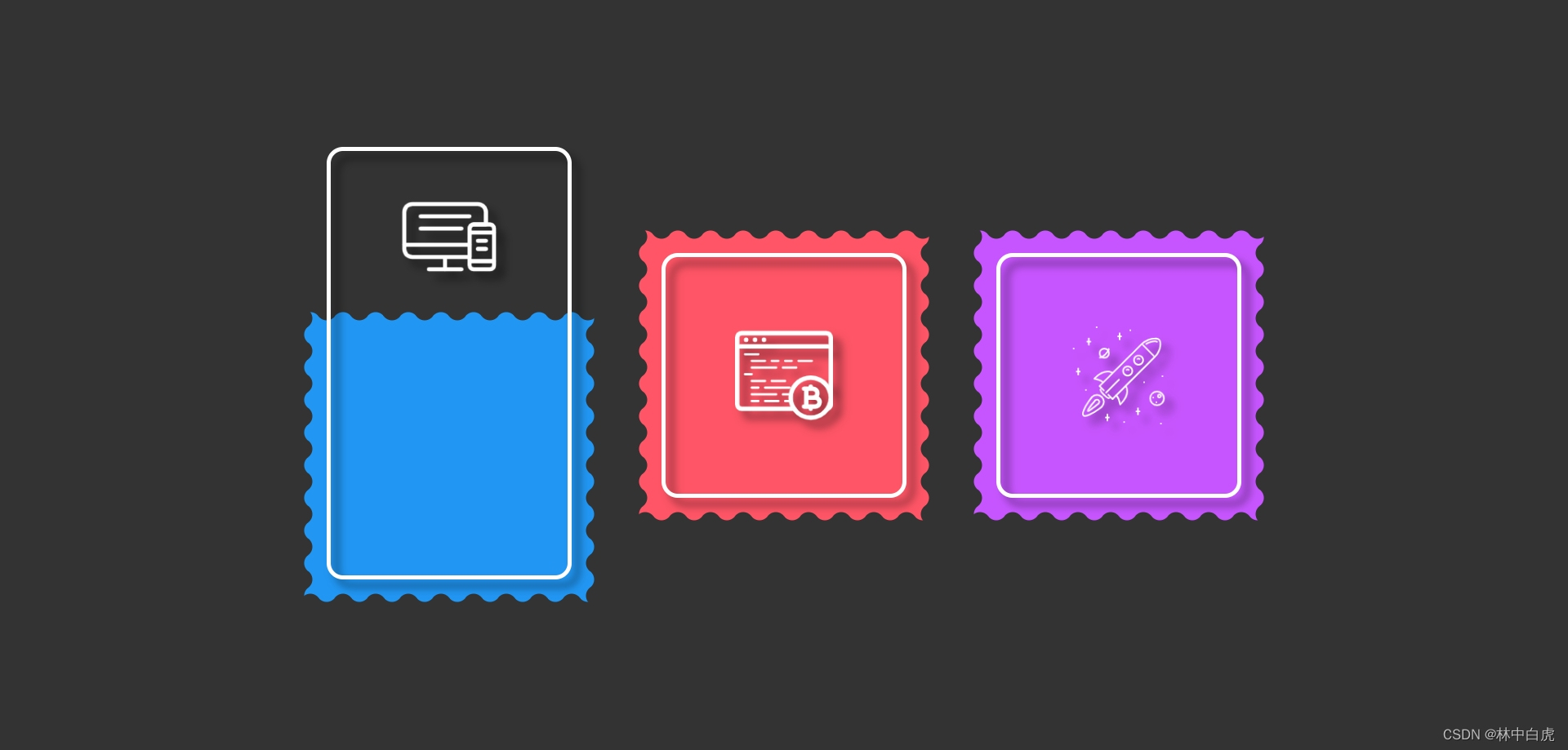
实现上述代码后的效果如下:
编写卡片容器内部元素样式
.container .box::before {
  content: "";
  position: absolute;
  inset: 30px 30px 30px 30px;
  border: 5px solid #fff;
  border-radius: 20px;
  filter: drop-shadow(10px 10px 5px rgba(0, 0, 0, 0.5));
  pointer-events: none;
  transition: 0.5s;
  z-index: 1;
}

.container .box img {
  position: absolute;
  z-index: 10;
  top: 120px;
  max-width: 120px;
  transition: 0.5s;
  /* 设置图片阴影 */
  filter: drop-shadow(10px 10px 5px rgba(0, 0, 0, 0.5));
}

/* 内容部分只有鼠标悬停才会显示,默认是收起隐藏 */
.container .box .content {
  opacity: 0;
  transition: 0.5s;
  text-align: center;
}
编写卡片波浪边框样式
.container .box span {
  position: absolute;
  inset: 0;
  rotate: calc(var(--i) * 90deg);
}

.container .box span::before {
  content: "";
  position: absolute;
  bottom: 0;
  width: 100%;
  background-repeat: repeat;
  height: 15px;
  background-image: radial-gradient(
    circle at 10px 15px,
    #333 12px,
    transparent 13px
  );
  background-size: 40px 20px;
  animation: anumate 0.5s linear infinite;
  /* 让波浪边框不会执行动画 */
  animation-play-state: paused;
}

.container .box span::after {
  content: "";
  position: absolute;
  bottom: 0;
  width: 100%;
  background-repeat: repeat;
  height: 10px;
  background-image: radial-gradient(
    circle at 10px -5px,
    transparent 12px,
    #333 13px
  );
  background-size: 20px 20px;
  animation: anumate 0.5s linear infinite;
  /* 让波浪边框不会执行动画 */
  animation-play-state: paused;
}
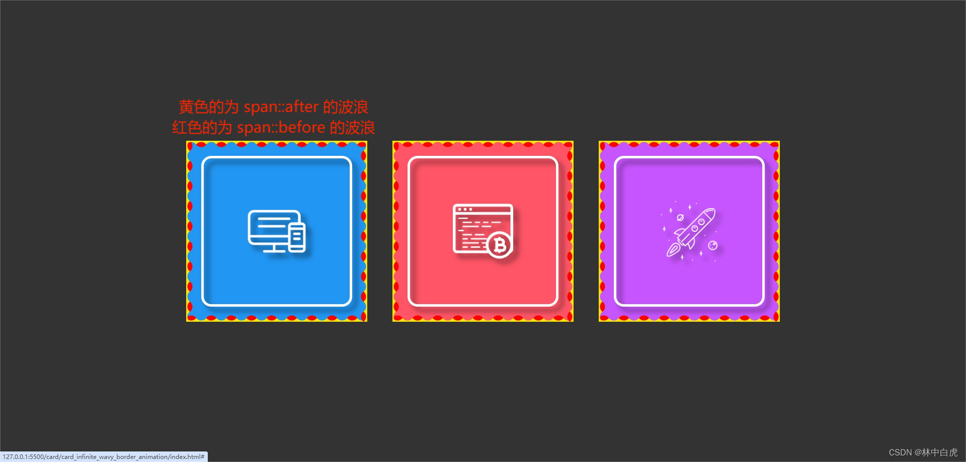
实现上述的样式后,效果如下:
编写鼠标悬停卡片后的样式
.container .box:hover {
  top: 100px;
}

.container .box:hover::before {
  inset: -200px 30px 30px 30px;
}

.container .box:hover img {
  top: -150px;
}
实现上的样式后,效果如下:
编写鼠标悬停卡片后内容展示的样式
.container .box .content {
  opacity: 0;
  transition: 0.5s;
  text-align: center;
}

.container .box:hover .content {
  opacity: 1;
}
.container .box .content h2 {
  font-size: 2em;
  color: #fff;
  text-align: center;
}

.container .box .content p {
  color: #fff;
  text-align: center;
}

.container .box .content a {
  position: relative;
  top: 20px;
  padding: 10px 20px;
  background: #fff;
  display: inline-block;
  color: #333;
  font-weight: 600;
  font-size: 1.1em;
  text-transform: uppercase;
  text-decoration: none;
}
实现波浪边框动画
.container .box:hover span::before,
.container .box:hover span::after {
  animation-play-state: running;
}

@keyframes anumate {
  0% {
    background-position: 0 0;
  }
  100% {
    background-position: 40px 0;
  }
}
完成上述的代码后,波浪边框就会开始执行动画。
完整代码下载
完整代码下载


