css3之3D转换
- 一.特点
- 二.坐标系
- 三.3D移动(translate3d)
- 1.概念
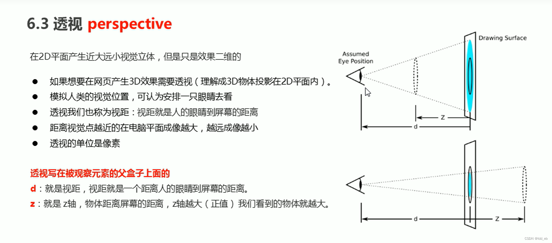
- 2.透视(perpective)(近大远小)(写在父盒子上)
- 四.3D旋转(rotate3d)
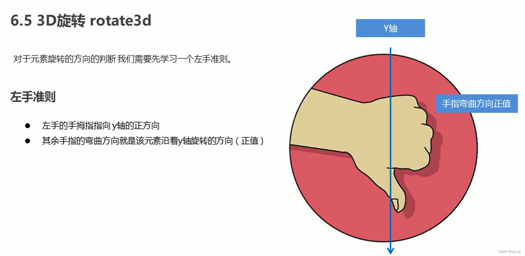
- 1.概念
- 2.左手准则
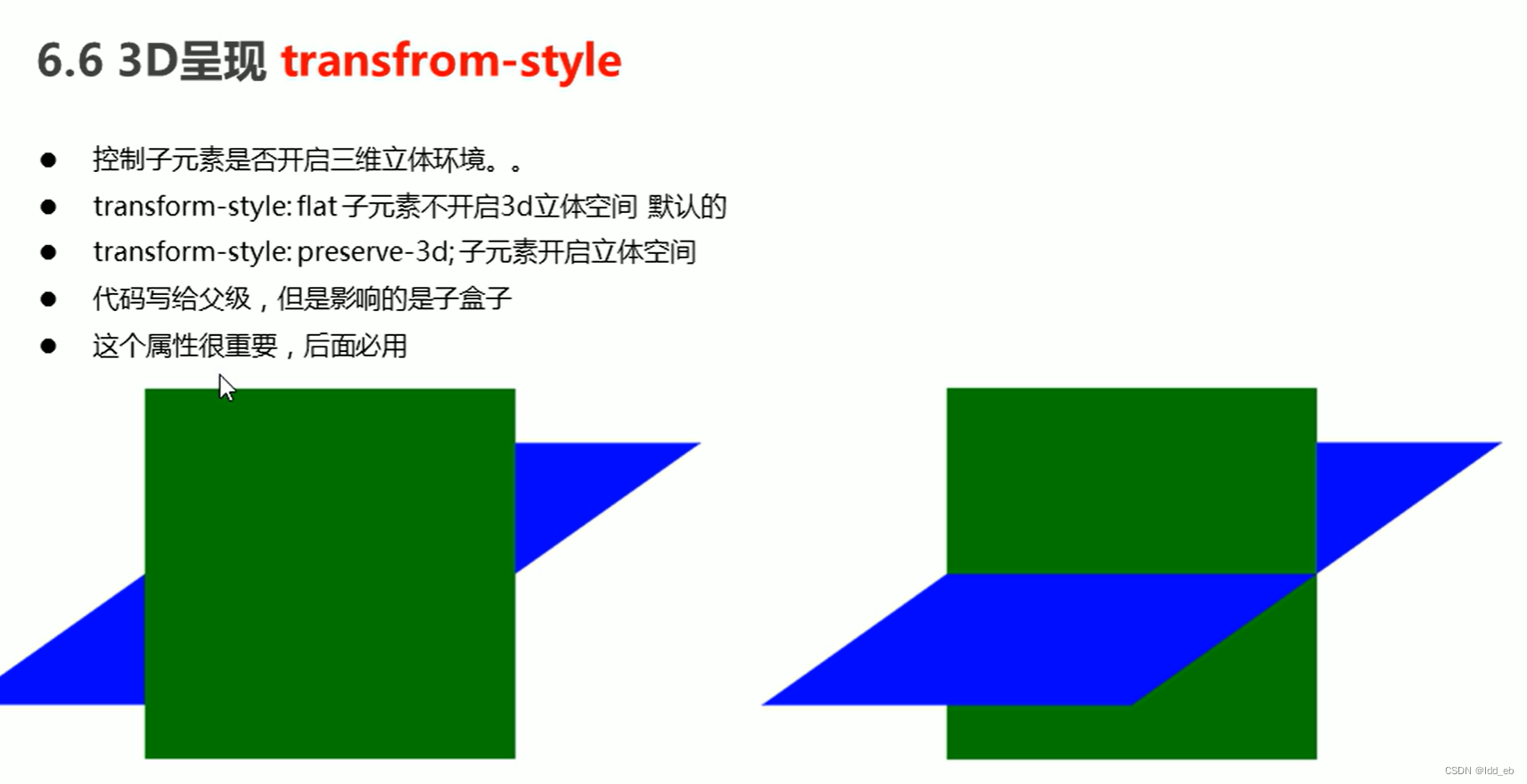
- 3.呈现(transfrom-style)(写父级盒子上)
- 4.总结
- 五.案例
- 1.两面旋转
- 2.导航栏
- 3.旋转木马
一.特点
近大远小,后面看不见
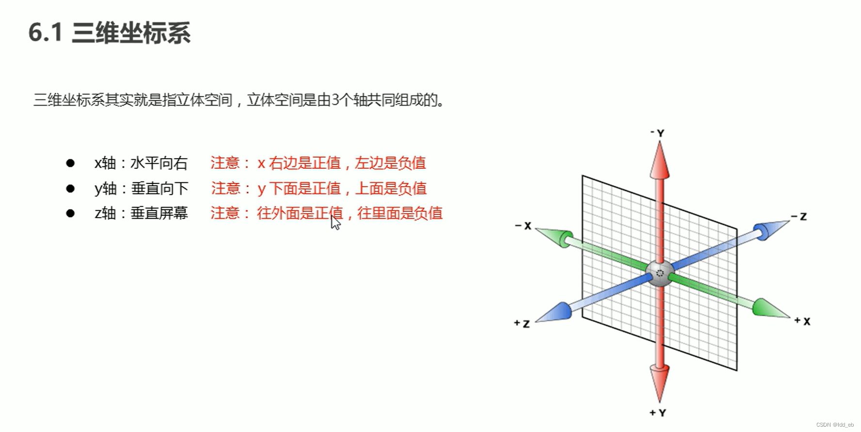
二.坐标系
三.3D移动(translate3d)
1.概念

2.透视(perpective)(近大远小)(写在父盒子上)
四.3D旋转(rotate3d)
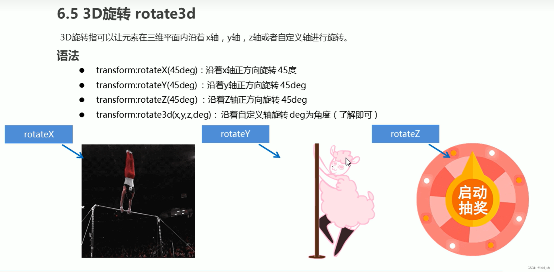
1.概念
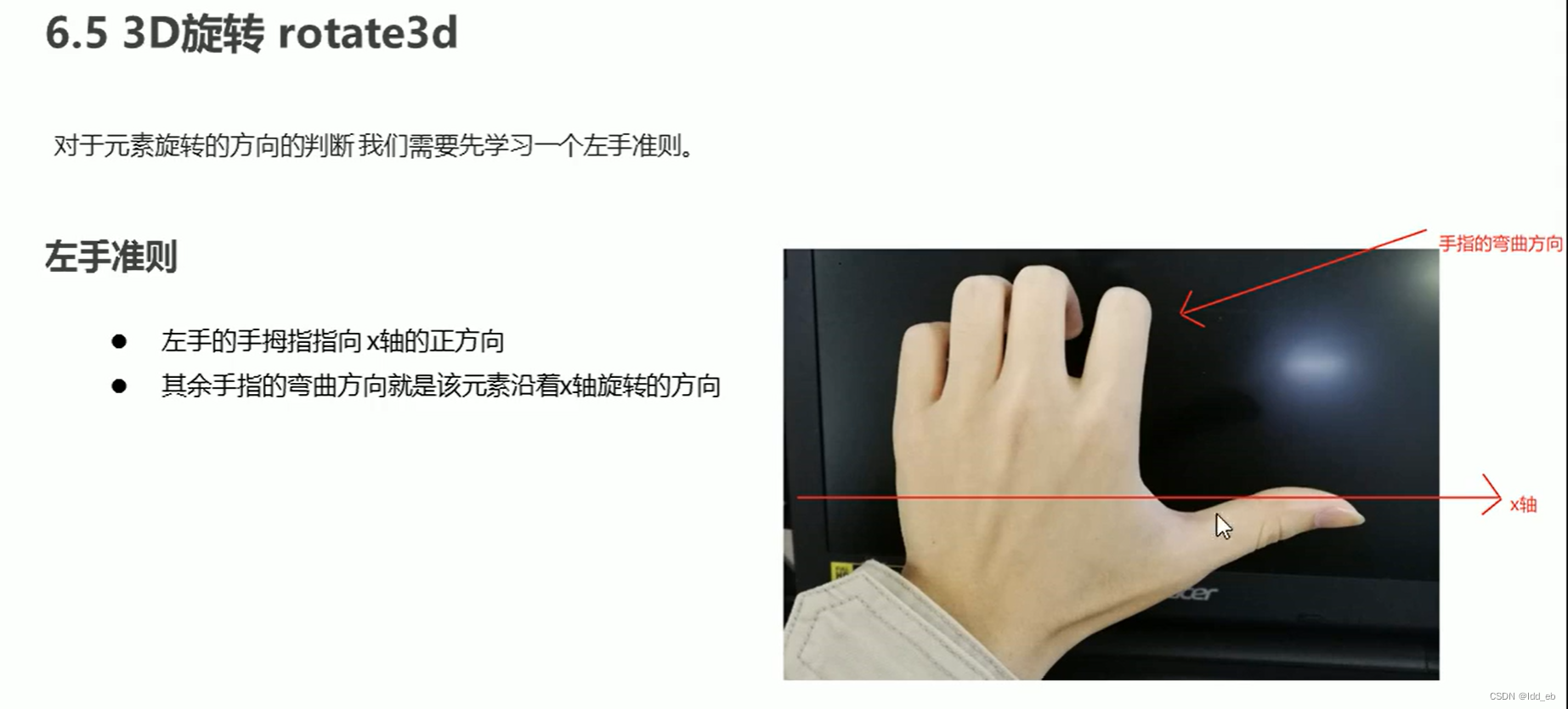
2.左手准则
(1)沿着x轴旋转
(2)沿着y轴旋转
3.呈现(transfrom-style)(写父级盒子上)
4.总结
五.案例
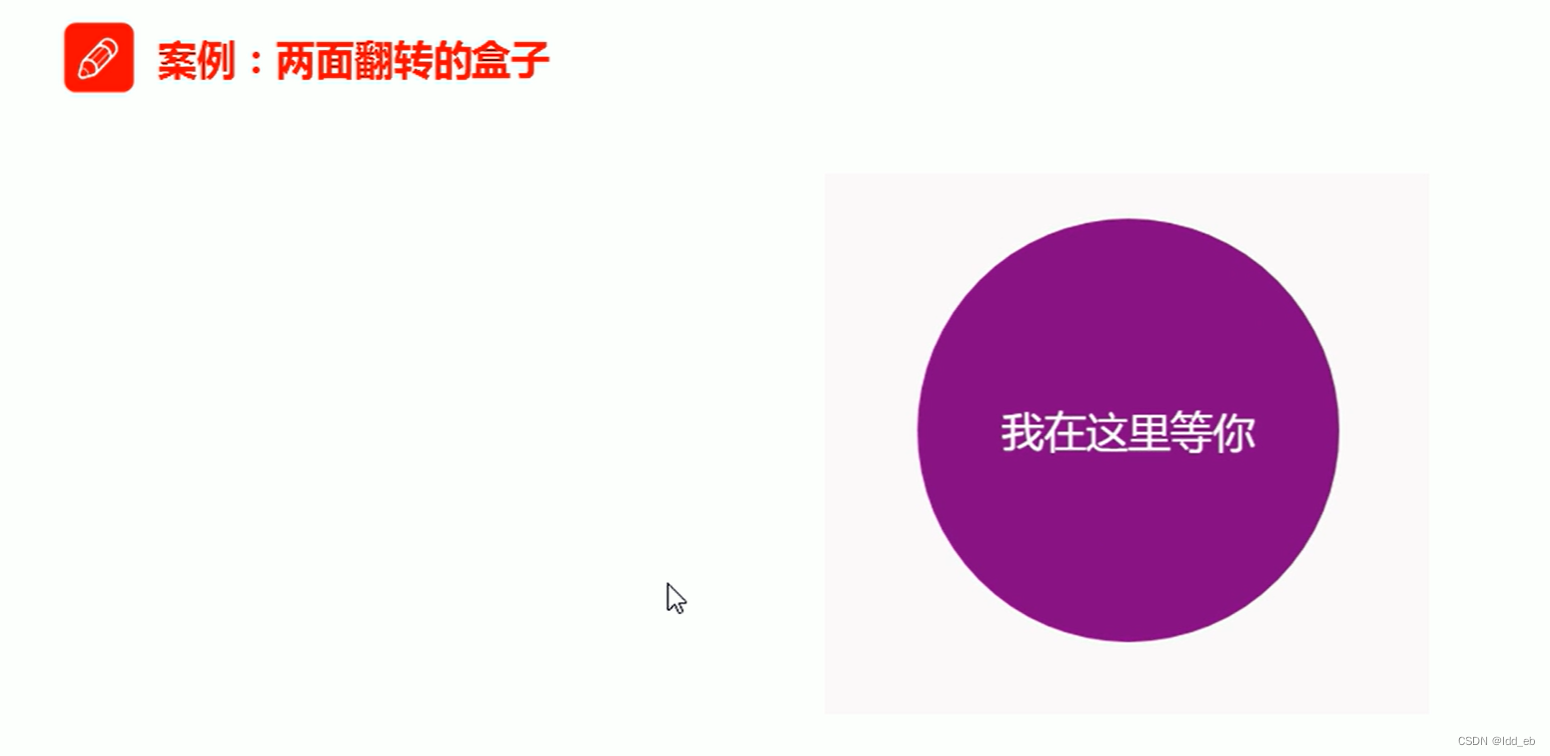
1.两面旋转
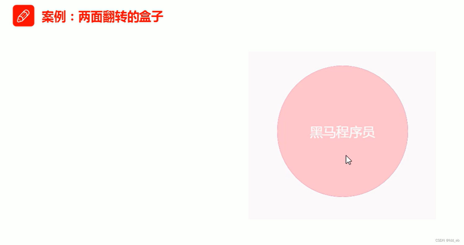
<head>
    <meta charset="UTF-8">
    <meta name="viewport" content="width=device-width, initial-scale=1.0">
    <title>Document</title>
    <style>
        body {
            perspective: 350px;

        }

        .box {
            position: relative;
            width: 300px;
            height: 300px;
            margin: 100px auto;
            transition: all .4s;
            transform-style: preserve-3d;
        }

        .box:hover {
            transform: rotateY(180deg);
        }

        .front,
        .back {
            position: absolute;
            top: 0;
            left: 0;
            width: 100%;
            height: 100%;
            border-radius: 50%;
            font-size: 30px;
            color: #fff;
            text-align: center;
            line-height: 300px;

        }

        .front {
            background-color: pink;
            z-index: 1;
        }

        .back {
            background-color: purple;
            /*背对背旋转180deg,字不会镜像*/
            transform: rotateY(180deg);


        }
    </style>
</head>

<body>
    <div class="box">
        <div class="front">黑马程序员</div>
        <div class="back">pink老师等你</div>
    </div>
</body>

</html>
2.导航栏

<head>
    <meta charset="UTF-8">
    <meta name="viewport" content="width=device-width, initial-scale=1.0">
    <title>Document</title>
</head>
<style>
    * {
        padding: 0;
        margin: 0;
    }

    ul {
        margin: 100px;
    }

    ul li {
        float: left;
        margin: 0 5px;
        width: 120px;
        height: 35px;
        list-style: none;
        perspective: 500px;
    }

    .box {
        position: relative;
        width: 100%;
        height: 100%;
        transform-style: preserve-3d;
        transition: all .4s;
        text-align: center;
        font-size: 16px;
        line-height: 35px;
    }

    .box:hover {
        transform: rotateX(90deg);
    }

    .front,
    .bottom {
        position: absolute;
        top: 0;
        left: 0;
        width: 100%;
        height: 100%;

    }

    .front {
        background-color: pink;
        z-index: 1;
        transform: translateZ(17.5px);
    }

    .bottom {
        background-color: purple;
        transform: translateY(17.5px) rotateX(-90deg);
    }
</style>

<body>
    <ul>
        <li>
            <div class="box">
                <div class="front">黑马程序员</div>
                <div class="bottom">pink老师等你</div>
            </div>
        </li>
    </ul>
</body>

</html>
3.旋转木马
<head>
    <meta charset="UTF-8">
    <meta name="viewport" content="width=device-width, initial-scale=1.0">
    <title>Document</title>
    <style>
        body {
            perspective: 600px;
        }

        section {
            position: relative;
            width: 300px;
            height: 200px;
            margin: 250px auto;
            transform-style: preserve-3d;
            animation: rotate 10s linear infinite;

        }

        section div {
            position: absolute;
            top: 0;
            left: 0;
            width: 100%;
            height: 100%;
            background: url(001a3fe237b2c5e71eeca0a5ca44c68c.png) no-repeat;
            background-size: 300px 200px;

        }

        section:hover {
            animation-play-state: paused;
        }

        section div:nth-child(1) {

            transform: rotateY(60deg) translateZ(300px);
        }

        section div:nth-child(2) {

            transform: rotateY(120deg) translateZ(300px);
        }

        section div:nth-child(3) {

            transform: rotateY(180deg) translateZ(300px);
        }

        section div:nth-child(4) {

            transform: rotateY(240deg)translateZ(300px);
        }

        section div:nth-child(5) {

            transform: rotateY(300deg)translateZ(300px);
        }

        section div:nth-child(6) {

            transform: rotateY(360deg)translateZ(300px);
        }

        @keyframes rotate {
            0% {
                transform: rotateY(0);
            }

            100% {
                transform: rotateY(360deg);
            }
        }
    </style>
</head>

<body>
    <section>
        <div></div>
        <div></div>
        <div></div>
        <div></div>
        <div></div>
        <div></div>
    </section </body>

</html>


