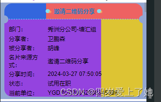
<template>
  <div class="home">
    <div class="card">
      <div class="t_box">
        <div class="top">
          <div class="title">
            <span></span>
            <text style="text-align: center; font-weight: 600">名称</text>
            <span></span>
          </div>
        </div>
      </div>
      <div class="b_box">
        <div class="MarginBot xzcode">
          <div class="left">部门:</div>
          <div class="right" style="text-align: left">6666</div>
        </div>
      </div>
    </div>
  </div>
</template>
    <style lang="less" scoped>
.card {
  width: 95%;
  border-radius: 40px;
  box-sizing: border-box;
  margin: 0 auto;
}

.top {
  box-sizing: border-box;
  padding-top: 20px;
  padding-bottom: 20px;
  border-bottom: 1px dashed #66e0fe;
  position: relative;
}

.title {
  display: flex;
  align-items: center;
  justify-content: center;
}

.title text {
  font-size: 30px;
  font-weight: bold;
  color: #147abe;
  padding: 0 13px 0 20px;
}

.title span {
  width: 21px;
  height: 21px;
  background: #7fe0f7;
  border-radius: 50%;
  position: relative;
}

.title span::after {
  content: "";
  position: absolute;
  width: 14px;
  height: 14px;
  background: rgba(255, 190, 85, 0.58);
  border-radius: 50%;
  bottom: 0;
  right: -7px;
}


.t_box {
    /* 设置边框的圆角半径,分别是左上、右上、右下、左下四个角的圆角半径,这里表示左上和右上角是圆角的,而左下和右下角是直角的。*/
  border-radius: 40px 40px 0 0;
  /* 设置内边距,上下为0像素,左右为24像素。*/
  padding: 0 24px;
  /* 设置背景图片的尺寸,第一个值是宽度的百分比,第二个值是高度的百分比。*/
  background-size: 70% 100%;
  /* 设置背景图片,这里使用了两个径向渐变(radial-gradient),分别对应两个圆形渐变,实现两种颜色的渐变效果*/
  background-image: radial-gradient(
      circle at 100% 100%,
      transparent 0,
      transparent 20px,
      #ee6262 20px
    ),
    /****

radial-gradient(
      circle at 100% 100%,
      transparent 0,
      transparent 20px,
      #ee6262 20px
    ),

这段代码是一个径向渐变(radial-gradient),用于创建一个圆形的渐变效果。让我来解释一下这段代码的具体含义:

circle:表示渐变的形状为一个圆形。
at 0 100%:表示渐变的起始点在背景区域的左下角。
transparent 0:表示渐变的起始颜色是透明的,位置为0。
transparent 11px:表示从透明到11像素处的颜色渐变仍然是透明的。
#36d 11px:表示在距离11像素处开始渐变到颜色#36d(一种蓝色)。
综合起来,这段代码描述了一个从背景区域左下角开始的圆形渐变效果,从透明到蓝色(#36d),并且在距离11像素时完成颜色的过渡。这个渐变会被应用到背景图片中的一个部分,以实现视觉上的渐变效果。
*/
    radial-gradient(
      circle at 0 100%,
      transparent 0,
      transparent 20px,
      #36d 20px
    );
  /* 设置背景图片不重复。*/
  background-repeat: no-repeat;
  /* 设置背景图片的位置,第一个值对应第一个背景图片的位置(右下角),第二个值对应第二个背景图片的位置(左下角)。*/
  background-position: right bottom, left bottom;
}

.b_box {
  border-radius: 0 0 40px 40px;
  padding: 30px 24px 0;
  background-size: 70% 100%;
  background-image: radial-gradient(
      circle at 0 0,
      transparent 0,
      transparent 20px,
      #9443df 20px
    ),
    radial-gradient(
      circle at 100% 0,
      transparent 0,
      transparent 20px,
      #ddc433 20px
    );
  background-repeat: no-repeat;
  background-position: left top, right top;
}
</style>
上下两部分中间那个缺失半圆角用的是背景颜色图片+圆形渐变完成的
第二种
<div class="card">
       <div class="t_box">666</div>
       <div class="b_box">777</div>
   </div>
//参考网站:https://blog.csdn.net/B_rabbit_d/article/details/119645778?spm=1001.2014.3001.5506
//参考网站:https://www.jianshu.com/p/52103187aac6

.card {
       width: 95%;
       box-sizing: border-box;
       margin: 0 auto;
       overflow: hidden;
       display: flex;
       .t_box {
         width: 30%;
         padding: 15px;
         position: relative;
         background: radial-gradient(
               circle at right top,
               transparent 10px,
               #28a4f2 0
             )
             right top / 100% 50% no-repeat,
           radial-gradient(circle at right bottom, transparent 10px, #28a4f2 0)
             right bottom / 100% 50% no-repeat;
       }

       .b_box {
         width: 70%;
         padding: 10px 24px;
         position: relative;
         background: radial-gradient(
               circle at left top,
               transparent 10px,
               #70b0da 0
             )
             right top / 100% 50% no-repeat,
           radial-gradient(circle at left bottom, transparent 10px, #70b0da 0)
             right bottom / 100% 50% no-repeat;
       }
     }


