实现元素水平垂直居中的几种方法:
<div id="wrap">
  <div class="box"></div>
</div>
1. 定位方法实现水平垂直居中
<style>
*{
  margin: 0;
  padding: 0;
}
#wrap {
  width: 500px;
  height: 500px;
  background: grey;
  position: relative;
}
#wrap .box {
  width: 200px;
  height: 200px;
  background: pink;
  left: 0;
  right: 0;
  top: 0;
  bottom: 0;
  margin: auto;
  position: absolute;
}
</style>
定位和transform方法实现元素水平垂直居中
<style>
*{
  margin: 0;
  padding: 0;
}
#wrap {
  width: 500px;
  height: 500px;
  background: grey;
  position: relative;
}
#wrap .box {
  width: 200px;
  height: 200px;
  background: pink;
  position: absolute;
  left: 50%;
  top: 50%;
  transform: translate(-50%, -50%);
}
</style>
3. 最新版本的flex实现元素的水平垂直居中
<style>
*{
  margin: 0;
  padding: 0;
}
#wrap {
  width: 500px;
  height: 500px;
  background: grey;
  display: flex;
  justify-content: center;
  align-items: center;
}
#wrap .box {
  width: 200px;
  height: 200px;
  background: pink;
}
</style>
4. 使用老版本flex实现元素水平垂直居中
<style>
*{
margin: 0;
padding: 0;
}
#wrap {
width: 500px;
height: 500px;
background: grey;
display: box;
box-pack: center;
box-align: center;
}
#wrap .box {
width: 200px;
height: 200px;
background: pink;
}
</style>用纯css创建一个三角形
主要是把高度和宽度设置成为0,用边框来实现三角形效果
html代码:
<div id="box">
  </div>
css代码:
<style>
*{
  margin: 0;
  padding: 0;
}
#box {
  width: 0px;
  height: 0px;
  border: 100px solid ;
  border-top-color: red;
  border-right-color: blue;
  border-left-color: yellowgreen;
  border-bottom-color: deeppink;

}
</style>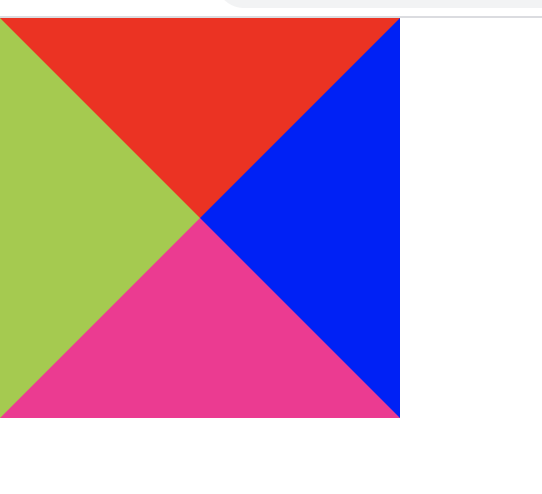
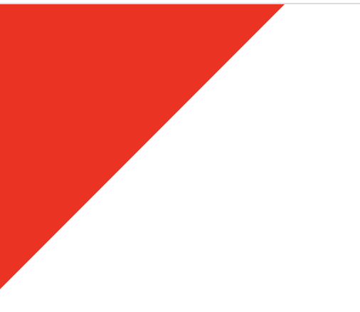
由上图效果可以根据自己需要三角形类型改成相应边框的颜色,不需要的边框设置成transparent
如例子:左边和上边的边框设置成红色
#box {
  width: 0px;
  height: 0px;
  border: 100px solid ;
  border-top-color: red;
  border-right-color: transparent;
  border-left-color: red;
  border-bottom-color:transparent ;

}
如何实现移动端rem适配
html根元素的字体大小设置屏幕区域的宽
<div id="box">
</div><style>
*{
margin: 0;
padding: 0;
}
#box {
width: 1rem;
height: 1rem;
background: red;
}
</style><script type="text/javascript">
window.onload = function () {
// 获取屏幕区域宽度
var width=document.documentElement.clientWidth
// 获取html
var htmlNode = document.querySelector('html')
// 设置字体大小
htmlNode.style.fontSize= width + 'px'
}
</script>


